EV Dashboard

Power BI Visualization

Overview

The EV Engineering Insights Dashboard, developed using Power BI, was designed to provide engineers with a comprehensive understanding of the distribution of electric vehicles (EVs) within the Xcel Territory. The dashboard aimed to address the need for a system-wide, spatial view of the electric distribution system. The executive level dashboard initially presented an overwhelming amount of information across over 20 pages, lacking geographical representations. To enhance the technical aspects for hiring managers, the dashboard utilized Power BI's functionality, such as slicers for granular data views, and mapping features to visualize the geographic distribution of EVs.

The use of Power BI's features, including Power Query for data transformation, Power Pivot for in-memory analytics, and Power View for interactive data visualization, contributed to the technical depth of the project. The dashboard's technical sophistication lies in its ability to extract insights from complex EV adoption data, categorize vehicles based on model and make, and provide a comprehensive view of the evolving landscape of electric mobility.

In summary, the EV Engineering Insights Dashboard not only provided a simplified, spatial view of the electric distribution system for engineers but also demonstrated technical prowess through its use of Power BI's advanced features for data analysis and visualization.

Data Processing and Analysis 

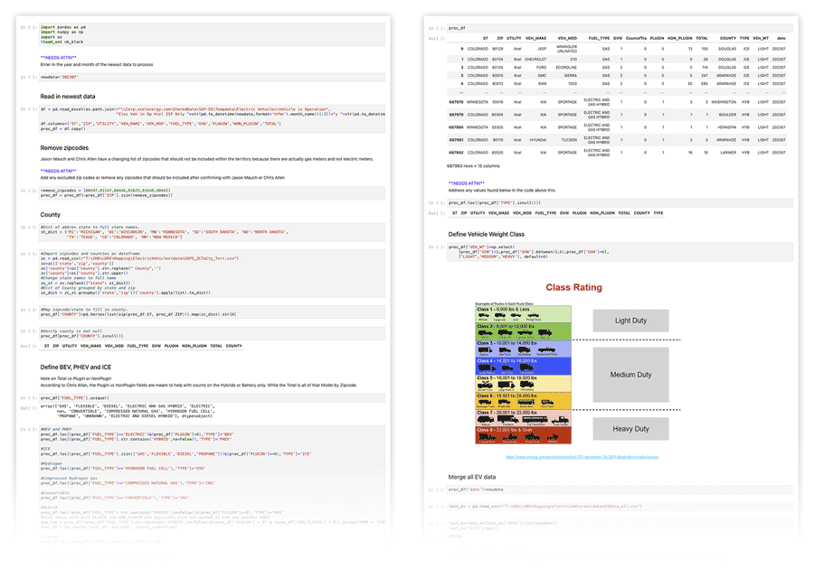
The EV Engineering Insights Dashboard was built upon a comprehensive dataset derived from vehicle registrations, which were captured at the end of the month in question and organized by zip code. Subsequently, additional vehicle information, including weight, axles, and fuel options, was integrated from a vendor source. To enrich the dataset further, a Python script, comprising over 20,000 lines of code, was developed to append county information from census bureau files. This process involved mapping each vehicle type based on fuel and plug-in options, differentiating between hybrid and battery electric vehicles. Moreover, the script categorized vehicles into Heavy, Medium, and Light classes based on their weight, providing insights into the electric charging requirements.

The python packages used were pandas, numpy, os, nb_black, geopandas, and shapely. The processed data was then validated through a comparison with the original CSV data and appended to a historical record of previous registration months to visualize changes over time. Additionally, a comparative analysis was conducted between the current dataset and the previous year's data to highlight the Year over Year change in EV registrations by zip code.

This meticulous data processing and analysis not only laid the foundation for the EV Engineering Insights Dashboard but also demonstrated a high level of technical expertise in handling and interpreting complex vehicle registration data.

Data Visualization and Geospatial Analysis

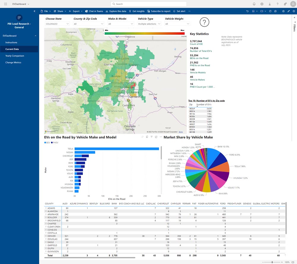
The first page of the EV Engineering Insights Dashboard prominently features a map that visually represents the geospatial distribution of registered Battery Electric Vehicles (BEVs) by zip code. This map provides a clear understanding of the concentration of BEVs in different areas within the Xcel Territory. Additionally, the dashboard presents specially calculated statistics, including the counts of Internal Combustion Engine (ICE) vehicles, BEVs, and Plug-in Hybrid Electric Vehicles (PHEVs), as well as the make and model of the vehicles. These statistics are further enhanced by displaying the county-level density of plug-in hybrid vehicles per 1000 residential Xcel customers, with variations observed across different states and zip codes.

The technical sophistication of the dashboard is evident in its interactive features, allowing users to filter the data by state, county, zip code, vehicle type, and vehicle weight. This enables a detailed visual breakdown of the types of EVs on the road, including market share by make. Furthermore, the expandable list of counties by makes provides a comprehensive view of the distribution of EVs at the county, zip code, and state levels, allowing users to compare their EVs with those of their neighbors.

The use of geospatial analysis and interactive data visualization in the EV Engineering Insights Dashboard aligns with contemporary trends in data presentation and analysis. The integration of such advanced features not only enhances the technical depth of the dashboard but also provides valuable insights for engineers, analysts, and executives alike.

Historical EV Registration Analysis

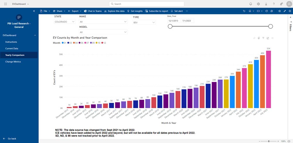
The EV Engineering Insights Dashboard features an interactive year/month comparison tool that leverages a comprehensive database of all EV registration updates from 2013 to 2023. This tool allows users to apply filters based on state, make, model, and vehicle type, including Internal Combustion Engine (ICE) vehicles. Additionally, a slider enables users to narrow down the date range for a more focused analysis of EV registration trends over time.

The technical complexity of this feature is underscored by its ability to handle and visualize a large volume of historical EV registration data. The interactive nature of the tool, combined with the extensive filtering options, empowers users to gain valuable insights into the evolution of the EV landscape over the years. By providing a user-friendly yet technically robust interface for exploring historical EV registration data, this feature enhances the dashboard's value for engineers, analysts, and executives, enabling them to make informed decisions based on the evolving trends in EV adoption.

Data Visualization and Geospatial Analysis

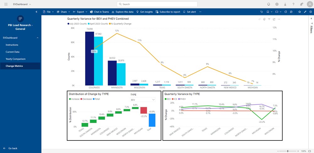
The final page of the EV Engineering Insights Dashboard provides a comprehensive comparison of the latest updated dataset with the previous version. This comparison is presented in the form of a percentage change line graph imposed on top of actual numbers represented as a bar graph, enabling users to visualize the magnitude of changes in EV registrations by state over a specific time period. The use of line graphs for percentage change and bar graphs for actual numbers is a best practice for comparing changes over time, as line graphs emphasize the change from period to period, while bar graphs are effective for showing change over time.

Furthermore, the dashboard includes a "Distribution of Change by TYPE" section, allowing users to observe the change in the distribution of Battery Electric Vehicles (BEVs), Plug-in Hybrid Electric Vehicles (PHEVs), and Internal Combustion Engine (ICE) vehicles by state from the last update. This feature provides a detailed breakdown of how the composition of registered vehicles has evolved over time, offering valuable insights into the shifting landscape of EV adoption.

Additionally, the "Quarterly Variance by TYPE" feature presents a percentage line graph comparing the distribution of change by vehicle type and state over different quarters. This enables users to track the quarterly variations in the composition of EV registrations, facilitating a deeper understanding of the evolving trends in EV adoption across different states.

By incorporating these advanced comparative analysis features, the EV Engineering Insights Dashboard empowers users to gain valuable insights into the dynamic nature of EV registrations, making it a valuable tool for engineers, analysts, and executives seeking to stay abreast of the latest developments in the EV landscape.