Takeaways
It was challenging to build an image classifier since we hadn’t gone over any information about neural networks at this point in our instruction at General Assembly. I found the biggest roadblocks in condensing the Twitter images on the prediction side. In my RunOnTwitter.py code, I had issues with resizing after condensing to an array and went with np.expand_dims to overcome those issues.
Ultimately, my model had much higher accuracy scores in predicting people not wearing masks (89%) vs wearing them(50%). We hypothesized that was due to different mask patterns. Somebody wearing flower patterns, or a pattern that depicted a mouth may make it confusing for a neural network to understand. To solve this, I would like to train this model on more elaborate mask patterns to introduced that variety.
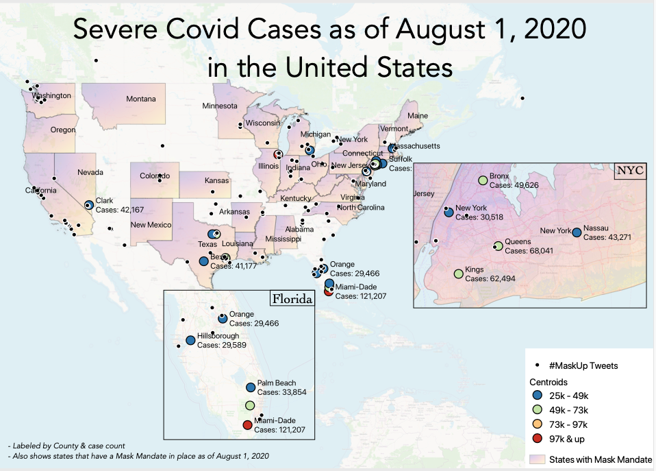
We also speculated on what could be commercial applications of this model. My favorite was to use it as a way of predicting areas that would have higher infection rates by mapping locations of higher anti-mask rates. The numbers presented in the accompanying notebook and pdf show a national average based on all the Twitter images. But, I could scrape tweets (using various hashtags) per state or county, put the images through the model, and map the percentage of mask vs non-mask wearers.